• Projects
  • About
  • News & recognition
  • Contact
  • Store
Menu

Leighton Hubbell  | Illustration + Design

  • Projects
  • About
  • News & recognition
  • Contact
  • Store

Astute Graphics April 2015 Featured Artist: Leighton Hubbell

June 5, 2015

A few months before I started putting together my March of Robots vector illustrations, I had purchased the full suite of Astute Graphics plugins for Adobe Illustrator. Let me just that they are amazing! Lots of time-saving tools and features that definitely make a difference in my workflow. So significant, I had to spread the word to many of my colleagues.

Well, go figure. Back in April, Astute Graphics has a Twitter contest of users tweeting their creations using the AG plugins. Lo and behold, yours truly gets a shout out and with that, they wanted to interview me. In addition to some usual chatter, I share some behind-the-scenes info about how I used them.

Check it out
In Awards and recognition, illustration Tags illustration, interview, Adobe Illustrator
LCH_Bancroft_logo_100412a.jpg

Designing the Bancroft Bulldogs logo

October 4, 2012

Just completed: a new sports mascot logo design and illustration done for the Bancroft Bulldogs, a private school located in Boston, Massachusetts. Bancroft School's ad agency, the Kor Group reached out to me about working with them on this fun and challenging project for the school's middle and high school students' sports program. They had seen some of my other sports work and wanted to create something bold, unique and tough to go with their chosen mascot, the bulldog. Well, the 'tough' thing about designing a bulldog mascot is, well it's been done – a lot. In fact, my biggest fear working on this project was treading on previously covered ground and having to start completely over. So, I thought the best tact to follow was to start sketching and see what comes up. After drafting up a few directions I would check my usual sources to see if we had something different enough to stand on its own, and go from there. Here are some initial thoughts on poses and profiles.

LCH_Bancroft_sketch_100412a

After those loose sketches, I worked up some stylizations of the poses and tried some variations on graphic approaches to the bulldog.

LCH_Bancroft_sketch_100412b

So, I sent these sketches over to the agency and got their feedback on the directions. Upon some review, I got some suggestions on which designs to focus on. I must say, I did quite a few sketches with dozens of refinements and variations to finally arrive at concepts I was happy with.

LCH_Bancroft_sketch_100412c

Finally, when the concept (that would eventually be the final design) came along, I think we all agreed that that was the one. What a relief! The next step was figuring out how the bulldog's head would be integrated into a completed logo.

LCH_Bancroft_logo_100412c

And then finally, the rather clean version of bulldog and angled, bold type would prevail as the final selection. As a regular practice, I try to apply the completed logo on to assorted clothing and athletic equipment so everyone can see how it will look in real world applications.

I hope you like the work. Special thanks to Bancroft School and Kor Group for the project.

LCH_Bancroft_logo_100412b
LCH_Bancroft_shirt_100412
LCH_Bancroft_helmet_100412

As an added bonus, I created a time lapse video of how the logo was rendered in Adobe Illustrator. It's roughly 4 hours of vector rendering time compressed into 3 minutes – all done from the approved pencil sketch. Enjoy.

In Apparel, Case studies, illustration, Logo design Tags apparel, Bancroft, Bulldogs, dog, graphic, high school, logo, logo design, logo illustration, mascot, private, spirit, sports, team, uniform
LCH_50th_illus_051412b.jpg

Tree of life - 50th Wedding anniversary illustration

May 14, 2012

This project was something that doesn't come around very often. If you're lucky, it's once in a lifetime. My wife's parents recently celebrated their 50th wedding anniversary – a truly amazing feat anyway you look at it. Two people have been able to share a wonderful life together, through thick and thin for half a century. That's pretty awesome. So, what in the world do you give them as a gift? Well, if you're like me, there's always someone in the family that will quickly throw your name in the hat to help out. That someone was my wife. Go figure.

To be honest, I have a great relationship with my in-laws and have shared a long history with their family. A lot of the adventures and experiences that the family has shared have been told to or experienced first-hand by me. When the concept of a tree-of-life was mentioned, I gave it a lot of thought. What better way to convey the many adventures they've shared together over 50 years, several states, three kids and a smattering of grandchildren? It made perfect sense and I was honored.

Now, I know this isn't the first tree-of-life illustration to grace the planet, but it would be my own personal rendition of the idea. I would take the many details and experiences from the family and try to depict them in icons, collected together into one, robust and sturdy tree. Since it would probably get pretty busy with all the different colors of everything, I tried to limit it to just two shades of blue. And, to make the tree even more special, I would draw the lower boughs into the shape of the number '50'. See if you can make that out in the last photo.

Some thumbnail sketches from the sketchbook.

LCH_50th_illus_051412

And, some details from the finished illustration.

LCH_50th_illus_051412c
LCH_50th_illus_051412d
LCH_50th_illus_051412a

Needless to say, they were very touched with the result. Big smiles on their faces, and even some tears – that's always nice to see. The best part is watching them pore through the different icons and interpreting the significance of each symbol and discovering details they hadn't noticed before.

It was certainly a great way of giving back to people who've made your life that much more complete – in their own way.

In Icon design, illustration, Personal projects, Sketching, Special projects Tags 50th, anniversary, blue, frame, framed, gift, icon, icon design, icons, illustration, life, personal, tree, tree of life, wedding
LCH_Lions_logo_680.jpg

The Lions Club's new vision.

October 20, 2009

I just completed a logo and illustration for the organization, Lions Club International. As in my case, you are probably familiar with the name, but not always up to speed with who they are or what they do.Every time you drive into a new city, you''ll see the LCI seal on the community''s Chamber of Commerce sign along with the Rotary Club, Elks Club and others. Lions are an international network of 1.3 million men and women in 202 countries and geographic areas who work together to answer the needs that challenge communities around the world.

Known for working to end preventable blindness, Lions participate in a vast variety of projects important to their communities. These projects range from cleaning up local parks to providing supplies to victims of natural disasters.

To get this rolling, the Chicago agency Lipman Hearne was hired by LCI to revamp their very established brand.

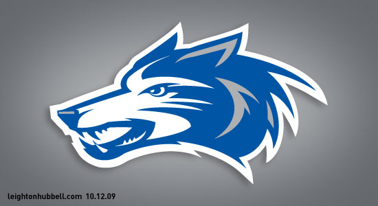
Initially, I was approached Lipman Hearne about illustrating the new lion for the logo redesign, but as we got further into the project my role extended into the design of the familiar crest and typography as well.

Lipman Hearne had done a very thorough job of researching the past logos as well as how the different charters had 'interpreted' the usage of the organization's logo. One of the main objectives would be to establish a new logo design that was bold and very versatile to make sure that the graphic standards would be easy to follow.

Since LCI's conception in 1917, there have been quite a few logos over the years, but mostly in an evolutionary sense. Most of them stayed in a crest shape and had the familiar lion's heads and initial capital 'L'. in the center. The typography appeared to be a different story, seeming to change with the font popularity of each era and even overrunning text into the crest – ruining readability.

LCH_LCI_work_102008.png

After some of our initial discussions, we agreed that this should be an evolutionary assignment with a good deal of clean up involved. One of the latest logos had almost a bad photocopy rendition of the lions, obviously making the transition from photostat (print) version to digital. Clean-up indeed.

Delving into the project, I soon had a dozen or so sketches of the new lion, with variations of the lion''s mane, teeth, expression and so on. Further decisions had to be about the crest shape and which influences I should use to create the shapes. I started off somewhat simple and we pared down to even simpler – almost basic.

A lesson in full-circle. My original design starts on the left and slowly ends in a cleaned-up version of two of the originals on the far right.

LCH_LCI_work2a_10_20_08.jpg

My versions of the lion's head started off as a very modern illustration and style. Some modifications were to try and balance the look of the open mouth and to avoid being too aggressive. Slowly, as the different directions were presented and the many clients gave their opinions, I was asked to do an overhaul on the ''bad photocopy'' version. This would be quite the challenge.

LCH_LCI_work3a_10_20_08.jpg

Some crest and type explorations for the new logo. These particular versions were trying to interpret some cleaner art-deco influences.

And finally, here is my final design as delivered.

LCH_Lions_logo_fnl_102009

So, as you take a look at the work, realize that in all the subtlety of the refinements there was a lot of thought and design that went into keeping the integrity of the LCI crest. Lipman Hearne has done a great job in bringing new life into the Lions Club International brand with their different applications.

In illustration, Logo design, Special projects Tags identity, Lions Club International, logo design, new, non-profit, vision
LCH_SanJac_work_680.jpg

San Jacinto logo illustration

October 12, 2009

Here's a new logo illustration project I completed for San Jacinto College, located in East Harris County, Texas. There are three campuses, each with its own rather established sports mascot. The assignment from their agency Whole Wheat Creative, was to help create a cohesive look and illustrative mascot style to the group of new logos, complete with custom typography and ligatures to be emblazoned on their newly updated uniforms. This was a particularly challenging project as there were many individuals with separate ideas, needs and opinions on how these designs should be handled. After several rounds of sketches and type explorations, here are the final results. Also included is a script direction, primarily for the baseball/softball uniforms that was not used in the final deliverables, but was fun and challenging to design.

LCH_SanJac_work6_101209.jpg
LCH_SanJac_work2_101209.jpg
LCH_SanJac_work3_101209.jpg
LCH_SanJac_work4_101209.jpg
LCH_SanJac_work5_101209.jpg
In Identity, illustration, Logo design, Logo lettering Tags Coyotes, design, Gators, logo illustration, mascot, Ravens, San Jacinto College, sports team

ON INSTAGRAM

A clip of an upcoming infographic illustration I'm hoping to complete soon. Think 'super fast'! #illustration #illustrator #infographic #vector #vectorart #adobeillustrator #aircraft #aircraftillustration
book10-badge-cl.png

Latest Posts

Featured
Feb 26, 2019
Logo design work appearing in LogoLounge 11
Feb 26, 2019
Feb 26, 2019
Jun 12, 2017
Logo design work honored in LogoLounge 10.
Jun 12, 2017
Jun 12, 2017
Mar 28, 2017
Work featured in Von Glitschka's Lynda.com course, Iconography.
Mar 28, 2017
Mar 28, 2017
Dec 7, 2016
New interview with Illustrative Designer, Leighton Hubbell on VoyageLA
Dec 7, 2016
Dec 7, 2016
Jan 4, 2016
Logo design work honored in LogoLounge 9
Jan 4, 2016
Jan 4, 2016
Jun 5, 2015
Astute Graphics April 2015 Featured Artist: Leighton Hubbell
Jun 5, 2015
Jun 5, 2015
Jul 18, 2014
Featured designer: Leighton Hubbell on the LogoLounge blog.
Jul 18, 2014
Jul 18, 2014
Jan 3, 2014
Featured work in Rockport's Design: Logo.
Jan 3, 2014
Jan 3, 2014
Dec 3, 2013
Logo design work appearing in LogoNest 03 - Black and white edition
Dec 3, 2013
Dec 3, 2013
May 29, 2013
Featured showcase on Logopond
May 29, 2013
May 29, 2013

All work is ©Copyright 2022 Leighton Hubbell and their respective owners.